Matfynd
Matfynd is a mobile app concept that helps budget-conscious users, especially students, plan affordable meals, manage grocery spending, and find local store discounts. It combines recipe discovery, price comparison, and budget tracking into one intuitive platform.
Role: UX/UI Designer & Researcher - Conducted user research, developed user flows, prototyped in Figma, and co-designed the app's visual identity in a collaborative team setting.
Methods & Tools: User Interviews • Surveys • Figma Prototyping • SCAMPER • Market Analysis • User Flows • Design Thinking

Background
With grocery prices rising over 20% in a single year, many students struggle to balance nutrition and budget. While researching this issue I identified a gap: no app combined budgeting, recipe discovery, and price comparison in one user-friendly platform. Matfynd was created to meet this need.
Challenge
How might we design a tool that helps students:
Stick to a weekly grocery budget
Waste less food
Discover easy, affordable recipes
The challenge wasn’t just to create a budgeting app, but to design a seamless user experience that solved real, overlapping pain points without overwhelming the user.

Research
User Research
Participants: 6 students, ages 18-30
Methods: Online surveys + semi-structured interviews
Focus: Grocery habits, cooking routines, budget concerns
Key Findings
Most participants wanted recipe suggestions based on discounted or pantry ingredients
Price comparison and budgeting were top priorities
75% prioritized financial tools over pantry tracking
Existing solutions were fragmented and difficult to use
Competitive Analysis
I analyzed apps like Matpriskollen, KitchenPal, and Pantry. While some offered useful features, none successfully integrated budgeting, offers, and recipe planning. For example:
Matpriskollen - Offers price comparisons and recipes but lacks a budget feature.
Pantry - Focuses on meal planning but doesn’t include price comparison or budgeting.
KitchenPal - Offers pantry tracking and recipe suggestions but is difficult to navigate and lacks budget options.
This research highlighted a clear opportunity for Matfynd to offer a combination of price comparison, budgeting and recipes in a more intuitive design.
Existing Apps
- Recipes
- Simple design
- Meal planner
- Shopping list
- Pantry tracking
- No budget options
- No offers or prices
- Compare prices
- Recipes
- Shopping list
- Hard to navigate
- No budget options
- Shopping list
- Pantry tracking
- Cluttered design
- No recipes
- No offers or prices
- No budget options
- Recipes
- Shopping list
- Food planning
- Simple design
- No budget options
- No offers or prices

Strategy & Ideation
Ideation Process
We used the SCAMPER method to rethink and combine features from existing apps. After evaluating feasibility and user needs, we prioritized four core solutions:
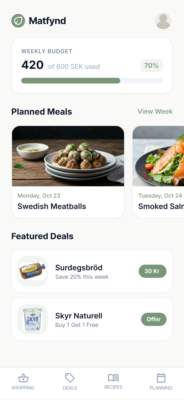
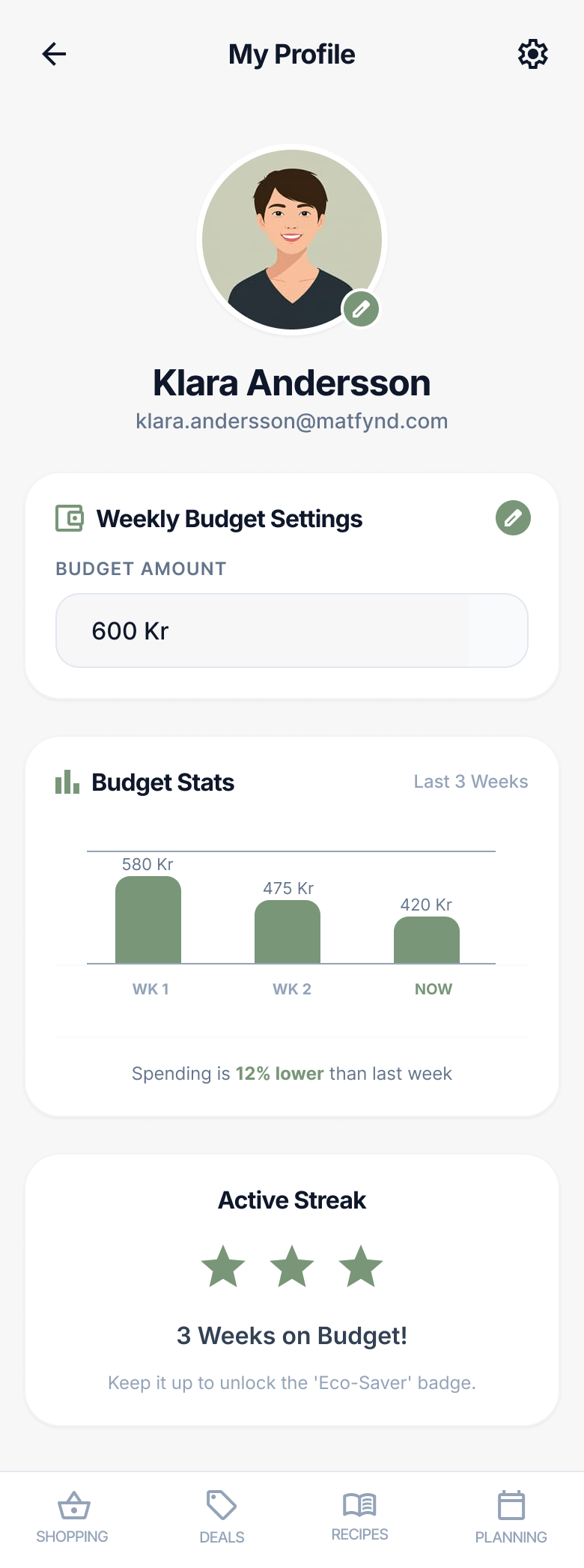
Budget Tracking - Weekly budget limit + progress indicator
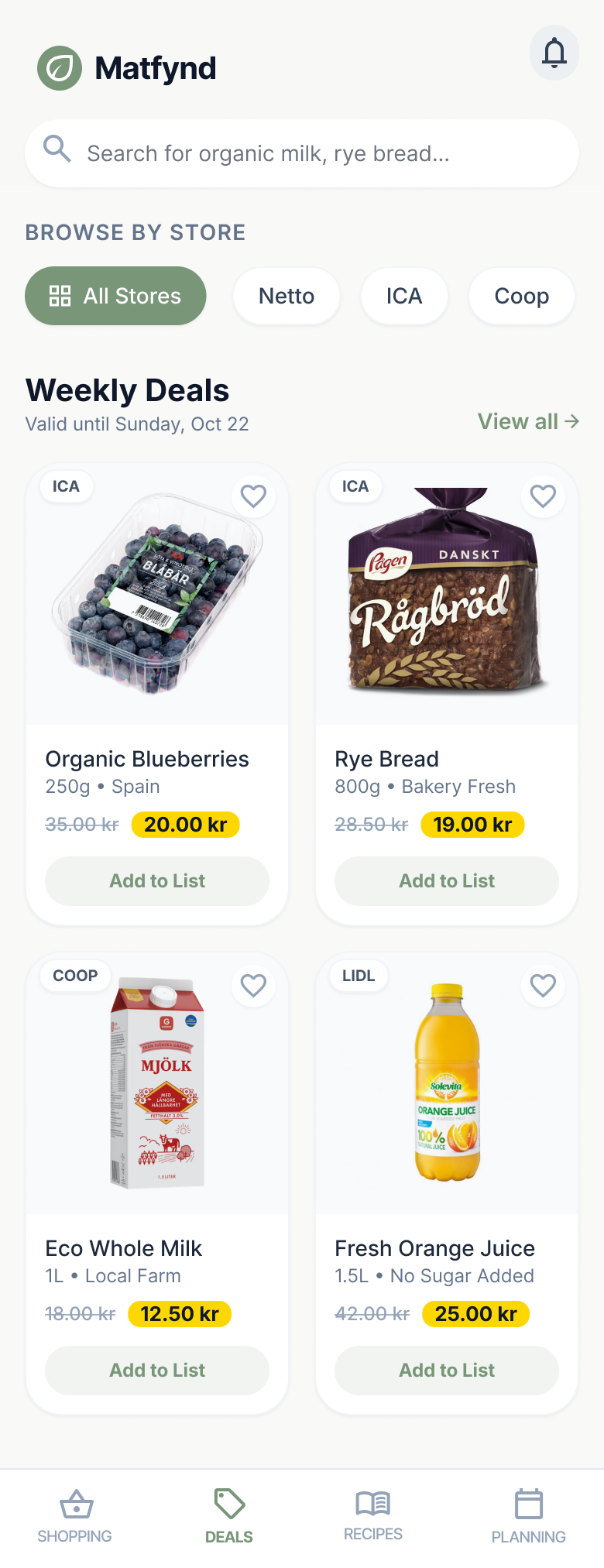
Price Comparison - View local grocery deals in one place
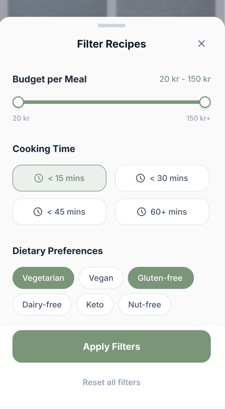
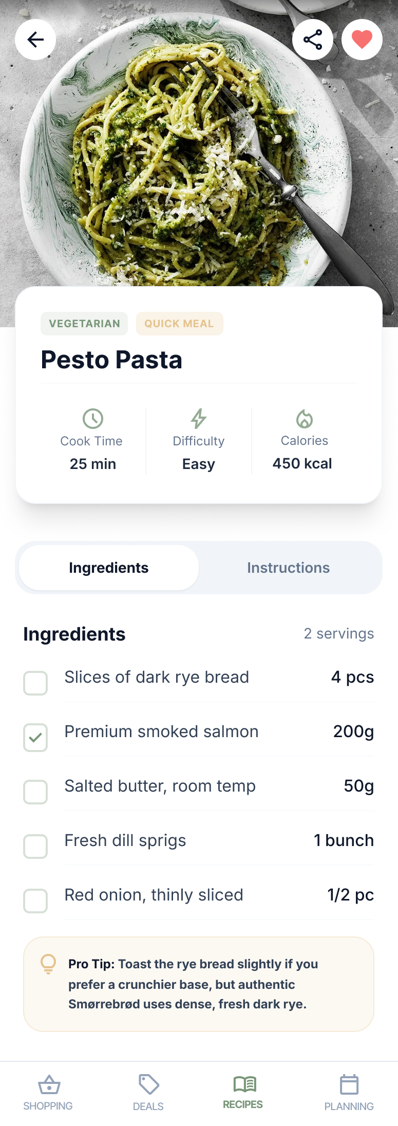
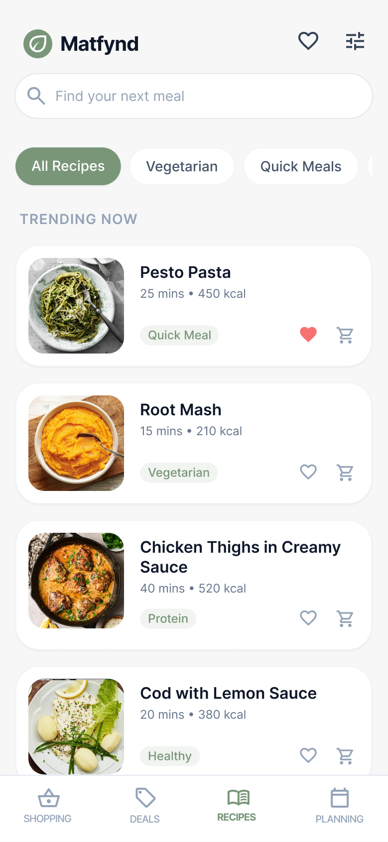
Recipe Discovery - Filter recipes based on budget and dietary preferences
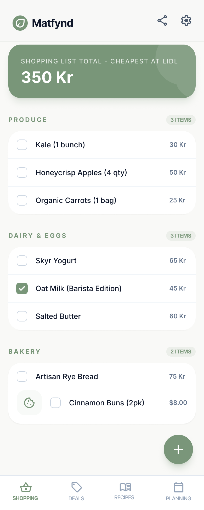
Shopping List - Auto-generated from saved recipes
Pantry tracking was excluded from the MVP due to low user demand and implementation complexity.

Pain Points

1. Food Waste
Food is thrown away because it’s hard to keep track of what is in the pantry.

2. Cooking
It’s hard to come up with new recipes and to find recipes that are based on one's preferences.

3. Economy
More money than is wanted is spent on groceries, leading to difficulties with one’s economy.

4. Deals
It’s hard to find the best deals for groceries when they are promoted on different websites / apps.

5. Unorganized Shopping
Shopping for groceries is stressful due to not having a structured and prepared list of what to buy.

Solutions

Pantry Tracker
An app that tracks the food in one’s pantry, fridge and freezer. Solves pain point 1.

Recipes
An app that recommends recipes with ingredients within one’s budget. Solves pain points 2 & 3.

Food Budget
An app that allows you to create a food budget and keep track of it. Solves pain point 3.

Compare Deals
An app that keeps offers from different grocery stores in the same place. Solves pain point 4.

Shopping List
An app that allows users to make a shopping list. Solves pain point 5.
Final Solution
Out of all ideated solutions, the prototype included:
Recipes
Food Budget
Compare Deals
Shopping List
These features were intentionally connected, allowing users to:
Set a weekly budget → Discover recipes within budget → Save recipes → Auto-add ingredients to shopping list → Shop efficiently and affordably
Pantry Tracking was intentionally excluded from the MVP, as only 25% of users prioritized it. Given our scope and resources, we focused on what would deliver the most value to the majority.

Design
Wireframes and Prototyping
The user research heavily influenced the design process. Starting with wireframes, we iterated through several versions based on user insights before moving to a low-fidelity prototype in Figma. We bypassed traditional sketches to focus on rapid digital iteration, ensuring the design stayed aligned with user needs.

Visual Design
We drew functional inspiration from Matpriskollen, but focused on cleaner navigation and a more intuitive UI. While Matpriskollen had helpful features, it was often difficult to navigate. The interface was therefore decluttered to reduce friction for users already stressed about budgeting.
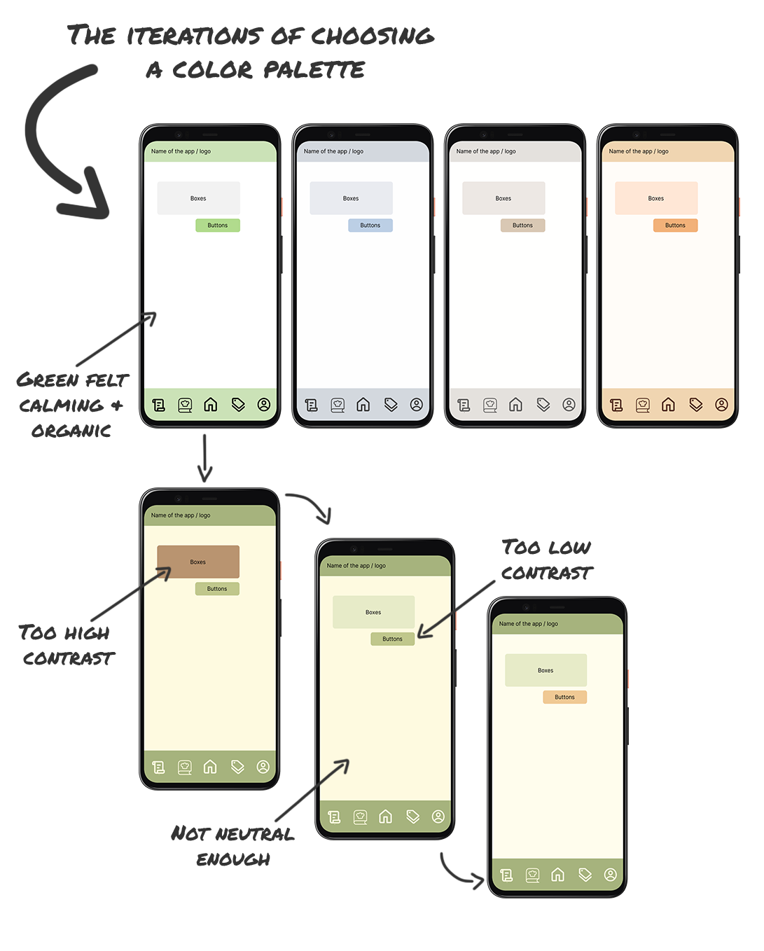
After testing various color palette styles, we chose a nature-inspired color palette to create a calm, friendly feel which aligned with user feedback. Later iterations improved contrast for better accessibility and usability.

Prototyping & Testing
Testing Feedback
- Good color palette
- Simple design
- Easy to navigate
- Logical layout
- Confusion regarding which page is active
- Menu icons feel mismatched
- Unclear cooking time customization
- Overwhelming recipe category images
Changes
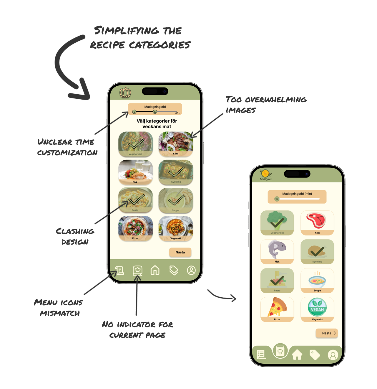
Based on the feedback, the prototype was altered in order to suit the final users’ wants and needs. Some changes that were made based on the feedback was simplifying the recipe categories and making the menu respond to which page the user is on. These changes are shown below.

Final Prototype
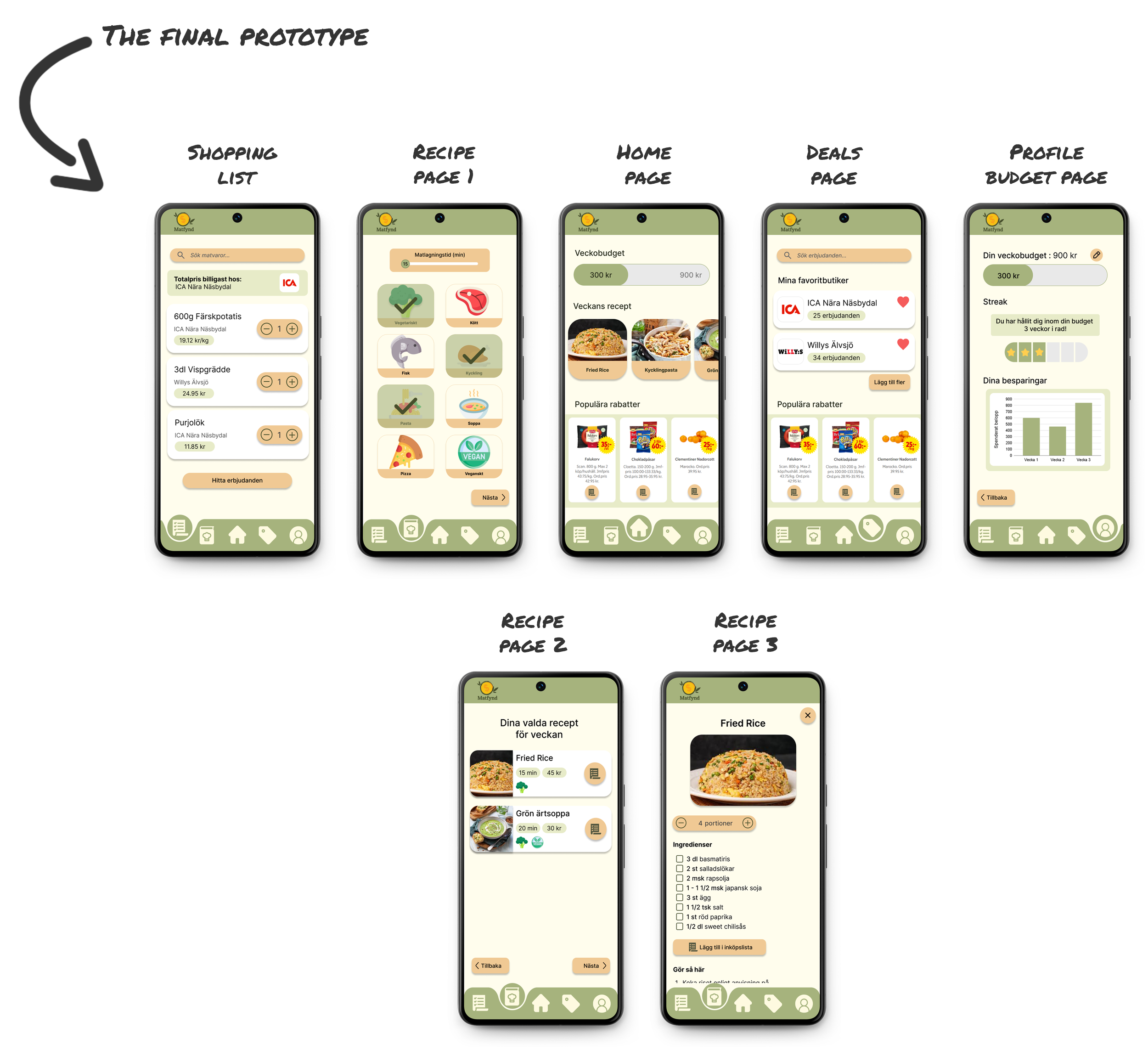

Outcome
The final prototype effectively addressed the three core challenges:
Helped users discover affordable meals
Enabled smart shopping within budget
Simplified decision-making through integrated tools
Delivered:
A validated hi-fi prototype in Figma
Prioritized features based on research
A visual design aligned with user preferences and accessibility standards
Limitations:
Pantry tracking and advanced personalization were de-scoped
Prototype was only peer-tested, further testing with broader users is needed
What Did I Learn?
User testing should happen more than once
Gathering early insights is not enough, you need to test final designs with the same users to confirm alignment.
Prioritization is part of design
We couldn’t build every requested feature, but by transparently working with users to rank needs, we chose the right features based on these needs.
Constraints spark creativity
Limited time and tools forced us to think critically and work lean, which sharpened my ability to prototype and iterate efficiently.
The SCAMPER method
While complex at first, helped push us beyond copying competitors and into rethinking functionality in meaningful ways.
Design Evolution
After completing the initial prototype, I revisited the visual design to better align with modern mobile UI standards.
While the core UX structure remained strong, I refined:
Visual hierarchy and spacing
Typography consistency
Component alignment
Accessibility and contrast
This iteration strengthened clarity, usability, and visual credibility.